Pretty much similarly to cycling teams often changing their outfits starting a new year (whether due to a change of sponsor(s) or simply to modernize their outfits), velowire has also chosen the new year to change its outfits.
Well, finally, you'll tell me, and I understand! I've been planning to change everything for some time, but I just didn't have enough time! So the time has finally come for the site to be updated with a design more compatible with the times and ... at the same time automatically adapted to mobile display, so you can consult the content from anywhere (computer, mobile or tablet).
CONTINUE READING AFTER THIS ADVERTISEMENT
A dated design!
Unchanged for at least fifteen years*, velowire.com's design was ... to say the least ... out of date!* When paris.thover.com became velowire.com in June 2011, the design was already identical, only the colors had been modified for the occasion. Since then, the smartphone has come to play an important role (as an example: despite the fact that it wasn't adapted at all, around 70% of velowire.com visitors came from a smartphone or tablet in 2023!) and it was therefore important to ensure that the site adapted to the screen size of the device from which it is being visited. While this has been on my "todo list" for a little over ten years, since then I've always prioritized content production (and my personal life, I admit!) over modifying the content, and it was really becoming a problem now!
A new design to kick off 2024
With the new year just around the corner, the idea was born to create a radically different design from the previous one, and to make the site responsive at the same time, so that it could be perfectly consulted from a smartphone.With a little help from my friend ChatGPT to create the base of the site (don't trust it blindly, you still need to know how to develop in HTML and CSS to create a functional site with the desired rendering, but it provides a good starting point), I took advantage of the quiet period of December to work on the desired rendering. Very deliberately, I chose a "dark mode" rendering, as this offers several advantages:
The "dark mode" of this design may also present a few drawbacks, which I don't mention here. I thus welcome your feedback on this choice (or on other elements of the new design)!
Other elements deliberately introduced in this design: a bar at the top and a bar at the bottom that remain fixed, with the content moving in-between. On both mobile and PC, this works. However, due to the lack of space on mobile, the top bar cannot contain the entire menu. The menu is therefore presented in the form of a "hamburger menu", based on the convention adopted by all of putting the menu behind an icon of 3 horizontal bars. In this way, a number of things (access to the home page, the search engine, language changes, the menu, social networks, copyright notices and contact details) remain accessible at all times, regardless of what content you're viewing or where you are on the page in question.
Greater use of icons within the site is also part of the choices made as part of this redesign. Easy to recognize, they help to guide visitors in their choices in the menu or in their understanding of the information displayed. The display of "live" content (TV programs or written tickers following a cycling race) is also evolving and gaining in visibility, without detracting from the consultation of other content. I'll also soon be introducing a few new design elements within articles, such as the way in which comments by quoted persons are mentioned within an article.
Furthermore, the display of advertisements should be a little more balanced than on the previous version of the site. Advertising is still necessary if the site is to survive (hosting costs a lot, and ads pay for at least that, but for the time spent on it, it's unrealistic to expect it to do so at this stage!)
Finally, as mentioned above in the advantages of the "dark mode", I wanted to be able to use more different colors (and the colors of the logo lend themselves very well to this!) within the content, to be able to better highlight certain parts of the content.
Some optimizations are still possible to get the most out of this new design (notably in the rendering on mobile). These will be implemented over the coming weeks and months, but should not result in any radical changes (I'm thinking, for example, of the way stages and results are displayed on mobile in the UCI cycling calendar).
CONTINUE READING AFTER THIS ADVERTISEMENT
A look at the before and after
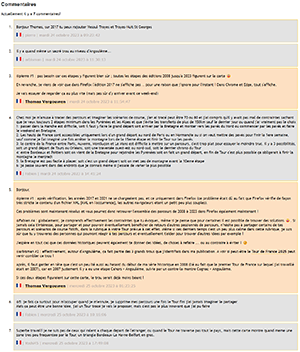
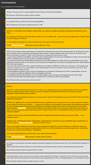
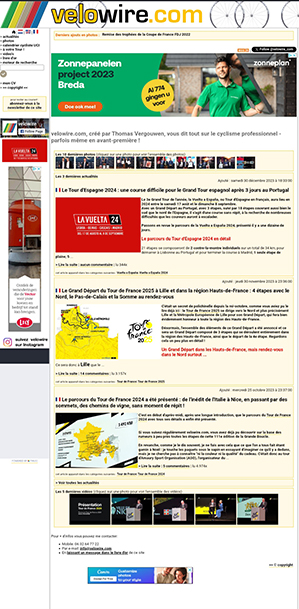
I'm not nostalgic about it, but a before-and-after comparison shows just how much change (and progress!) this site redesign represents.Here are a few before-and-after examples:
And more projects to come ...
Now that the site is compatible with mobile, this opens up the opportunity to develop a mobile application, for Android and iOS, so that you can use velowire even more easily on your mobile. This would, for example, make it possible to integrate cycling race maps in a dedicated section, which could, for example, enable you to position yourself on the map in relation to the race course!And do you have any other ideas for velowire? Let me know in the comments!door Thomas Vergouwen
Vond u dit artikel interessant? Laat het uw vrienden op Facebook weten door op de buttons hieronder te klikken!
1 comment | 2508 views
this publication is published in: The life of this site


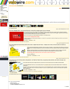
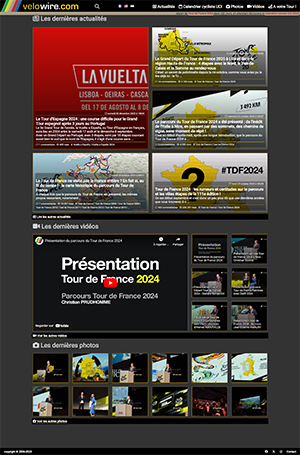
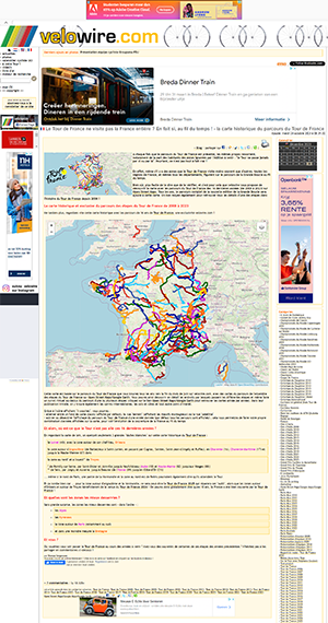
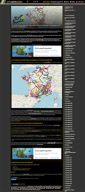

 by Thomas Vergouwen over
(bright mode tires the eyes because of its high intensity of white light, and this is even more obvious when it's dark, especially on a smartphone)
(I wouldn't want to be responsible for contributing to that! 😀 ; however, the theme created for the site doesn't filter blue light entirely, we need the bright colors to keep it attractive 😄)